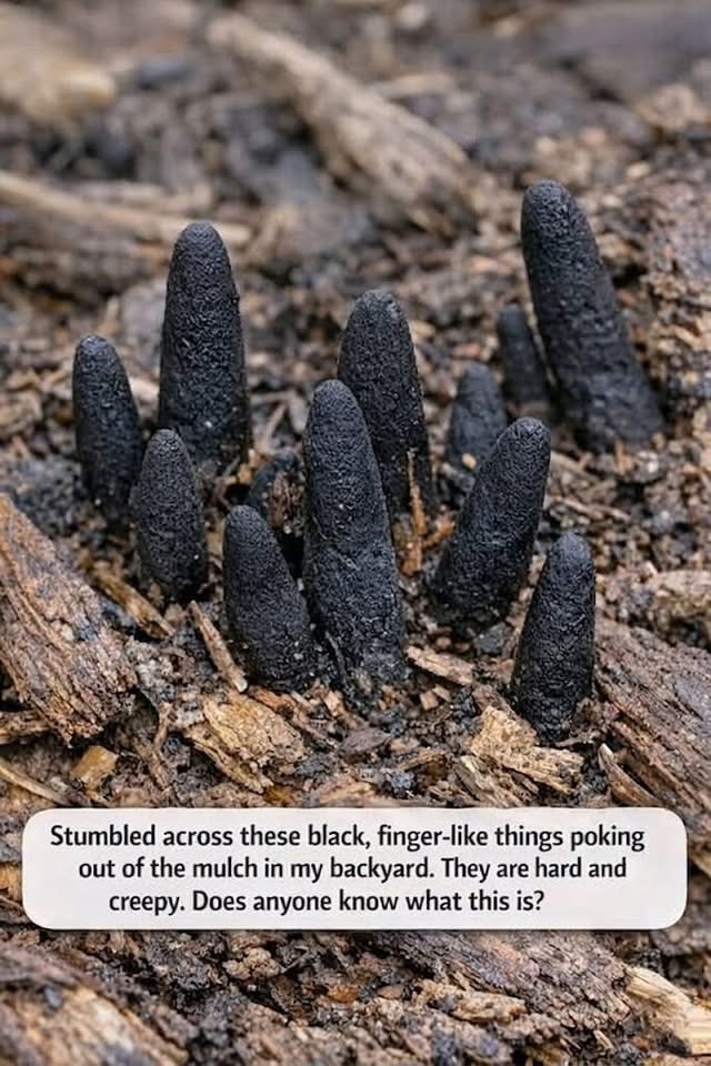
Finding unusual black growths pushing through mulch or garden soil can be surprising for any homeowner. With their dark, finger-like appearance, these odd formations often look dramatic enough to belong in a horror film rather than a backyard flower bed. It is easy to understand why people become concerned after spotting them near walkways, trees, or landscaping areas. However, despite their unsettling appearance, these mysterious structures are usually a naturally occurring fungus known as Dead Man’s Fingers, a species commonly found in wooded environments and gardens containing decaying organic material.
Dead Man’s Fingers is not a plant, but a type of fungus that feeds on decomposing wood beneath the soil surface. It often develops around buried roots, old tree stumps, hardwood mulch, or damp wood chips where moisture and shade are consistently present. When the fungus first appears, it may look pale or soft in color, but as it matures it gradually darkens into deep gray or black stalks with a rough texture. Because the clusters often resemble curled fingers emerging from the ground, the fungus earned its memorable common name. While visually unusual, it plays an important ecological role in breaking down organic matter naturally.
Fortunately, this fungus is generally considered harmless to people and household pets when simply touched or observed outdoors. It is not known for releasing dangerous substances into the air, and most animals tend to ignore it because of its tough texture and unappealing taste. In fact, from a gardening perspective, the presence of this fungus can actually indicate that natural decomposition is occurring properly within the soil. By helping break down dead wood and organic debris, fungi like Dead Man’s Fingers contribute to nutrient recycling that supports healthier soil conditions for surrounding plants and trees.
Homeowners who prefer to remove the fungus for appearance reasons can usually do so without difficulty. Wearing gardening gloves, the visible growths can be carefully pulled from the soil, especially if the decaying wood source beneath them is also removed. Reducing excess moisture, improving airflow, and replacing old mulch regularly may help discourage future growth. Alternatives such as gravel, pine needles, or cedar mulch can also make garden beds less favorable for fungi. While its appearance may initially seem alarming, Dead Man’s Fingers is often less a sign of danger and more a reminder of the hidden natural processes constantly taking place beneath the surface of healthy soil.