
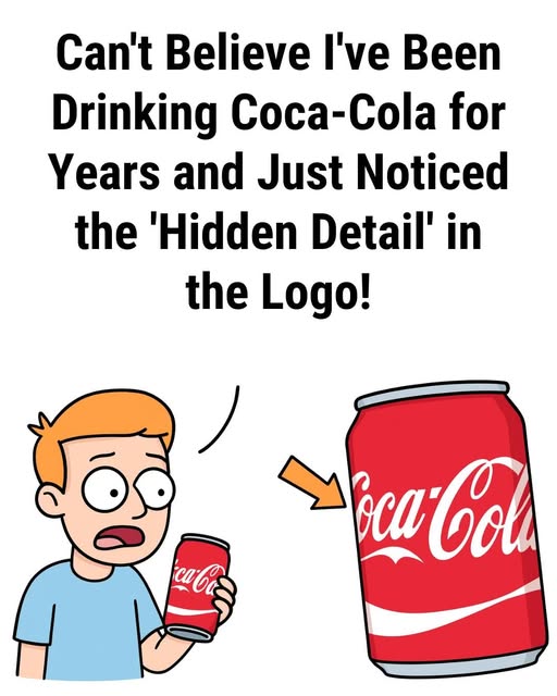
For more than a century, The Coca-Cola Company has relied on one of the most recognizable visual identities in the world. The flowing Spencerian script set against a bold red background has become deeply embedded in global culture, appearing on everything from storefront signs to collectible memorabilia. Recently, however, social media users began sharing magnified images of the logo, suggesting they had discovered an unexpected detail hidden within the lettering—something they claimed had gone unnoticed for years.
The online conversation centers on the negative space created between the capital “C” and the first “o” in the brand name. Some viewers believe the white space resembles a small figure or symbolic shape, depending on perspective. Design professionals, however, typically attribute this effect to the natural characteristics of handwritten script. When letters are connected in a flowing style—particularly one rooted in 19th-century penmanship—small pockets of empty space inevitably form. The human brain is wired to find patterns, often interpreting abstract shapes as recognizable images.
What truly propelled the discussion wasn’t necessarily the shape itself, but the shared sense of surprise. Many people admitted they had encountered the logo countless times without examining its fine details. This phenomenon highlights how viewers often absorb a brand’s overall impression without consciously analyzing its structure. Once attention is drawn to the negative space, though, the newly noticed detail becomes difficult to ignore, renewing interest in an otherwise familiar design.
Whether intentional or coincidental, the renewed fascination underscores the enduring strength of iconic branding. More than 130 years after its creation, the Coca-Cola script continues to invite fresh interpretation and conversation. In a digital age where small visual nuances can quickly become global talking points, even a subtle curve in a well-known logo can remind us that classic designs still hold the power to surprise.