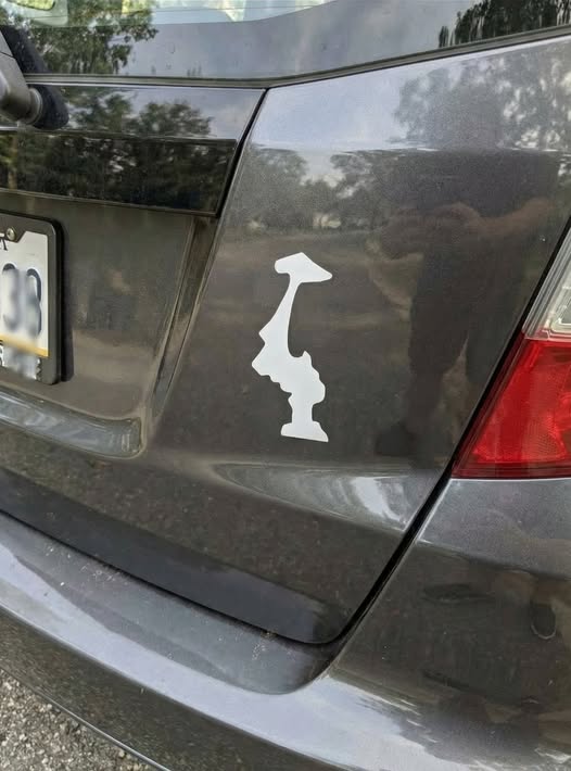
Travel through the Pacific Northwest and you may spot an unusual detail on car bumpers, reusable water bottles, and laptop covers: the outline of Washington state displayed completely upside down. At first glance, it can seem like a design error. But when the same inverted shape appears again and again, it becomes clear that the choice is intentional. For many residents, this small graphic has grown into a low-key emblem of local pride and shared regional humor.
The trend gained momentum in the 2010s, when minimalist state decals became popular accessories for outdoor enthusiasts and travelers. Washington’s easily recognizable silhouette made it an ideal candidate for creative reinterpretation. Flipping the outline added a playful twist that felt like an insider’s nod rather than a typical souvenir. Over time, what started as a subtle joke evolved into a recognizable tradition embraced by hikers, coffee shop regulars, and longtime locals who preferred something understated and distinctive.
The reasons behind the upside-down design vary, which only adds to its appeal. A common explanation points to the region’s famously rainy climate, with some joking that the state has been “turned over” by constant showers. Others see the inverted shape as a quiet, humble expression of hometown affection—free from bold slogans or flashy graphics. Some even suggest that the flipped outline resembles a mountain peak, a symbolic reference to Mount Rainier and the dramatic natural landscapes that define Washington’s identity.
Today, the upside-down decal represents more than a piece of vinyl. It reflects the character often associated with the Northwest: thoughtful, slightly unconventional, and deeply connected to nature. Many people continue to display it even after moving elsewhere, using it as a reminder of evergreen forests, ferry rides, and misty coastal mornings. For those familiar with the symbol, its meaning is instantly recognizable—a simple design carrying a shared sense of place.