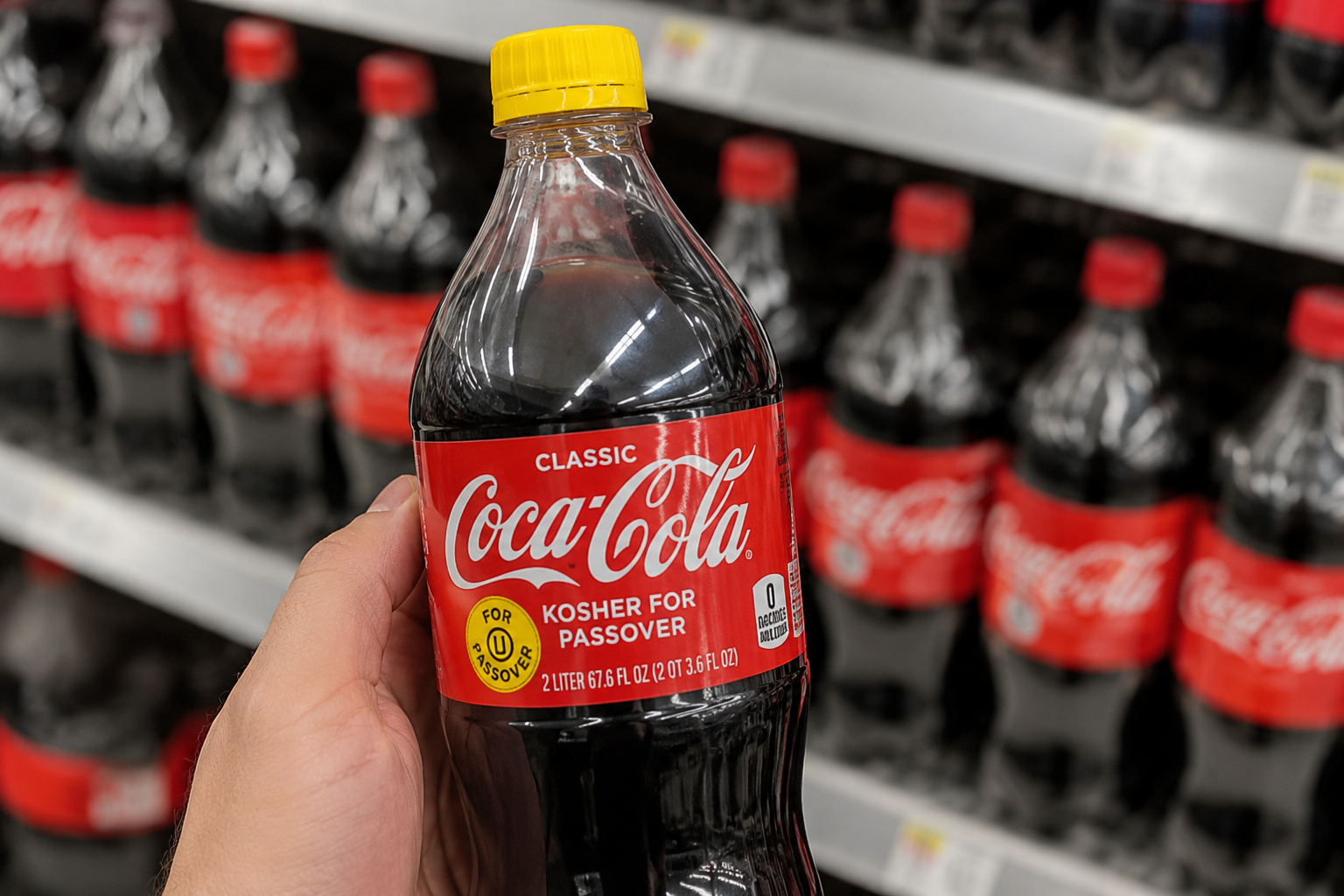
At first glance, a Coca-Cola bottle with a yellow cap may look like a special promotion or a limited-edition design. Since the familiar red cap has become one of the brand’s most recognizable features, the bright yellow version naturally catches shoppers’ attention. Many people assume it represents a new flavor or marketing campaign, but the explanation is much more practical. In reality, the different-colored cap serves as a simple way to identify a seasonal version of the beverage produced for a specific purpose.
Each year before Passover, Coca-Cola releases a limited supply of bottles made with cane sugar instead of high-fructose corn syrup. This adjustment allows the product to meet the dietary requirements observed by many Jewish families during the holiday. These bottles are prepared under additional kosher supervision and are clearly labeled as Kosher for Passover, helping consumers quickly identify the version that aligns with their traditions. The yellow cap acts as an easy visual marker, making the seasonal bottles simple to recognize on store shelves.
Although these bottles are intended primarily for Passover, they have also become popular with many consumers outside the Jewish community. Some people say they enjoy the taste of the cane sugar recipe and look forward to purchasing it whenever it becomes available. Because production is limited and the bottles are sold only during the weeks leading up to the holiday, they often become a sought-after seasonal item in grocery stores across the United States.
The yellow cap is a small packaging detail, but it represents a thoughtful adaptation to meet the needs of a diverse customer base. It also highlights how familiar products can be adjusted to respect cultural and religious traditions while remaining accessible to a broader audience. Sometimes, a simple change in packaging tells a much bigger story—one of tradition, consumer choice, and the many ways brands serve different communities throughout the year.