Few visual identities are as widely recognized as the flowing script of the Coca-Cola logo, set against its bold red backdrop. Over generations, it has become a symbol of consistency and global branding. Recently, renewed interest has grown around a subtle visual detail within the lettering—one that many people say changes how they see the design once it’s pointed out. This kind of observation highlights how everyday visuals can hold layers of meaning shaped not only by design, but also by perception.
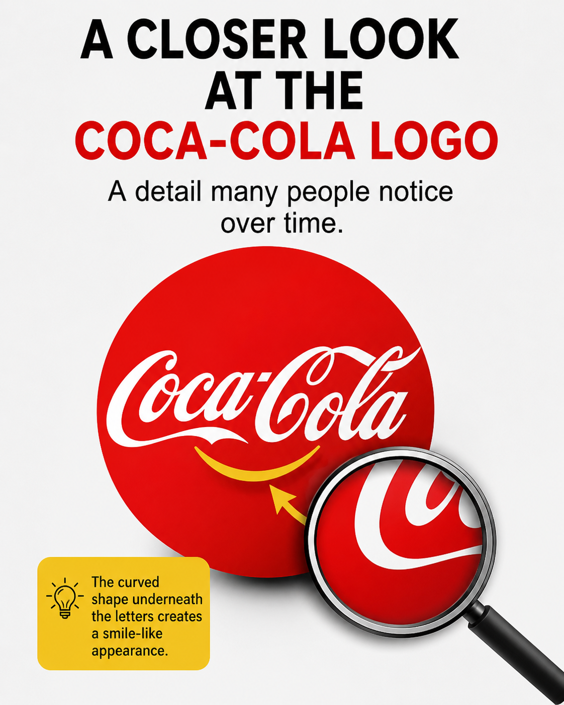
A practical way to explore this idea is to look closely at the structure of the lettering itself. The elegant curves of the script, particularly within the second word, create flowing lines that can resemble familiar shapes. Some viewers interpret these curves as forming a smile-like expression, giving the logo a friendly and approachable feel. While this interpretation is subjective, it demonstrates how the human eye often connects abstract forms to recognizable patterns.
Understanding the origin of the design provides helpful context. The logo was created in the late 19th century using Spencerian script, a popular handwriting style of the time known for its fluidity and balance. The intention behind the design focused on clarity, elegance, and distinctiveness rather than hidden imagery. This suggests that any perceived shapes or expressions are likely a natural result of the calligraphic style rather than a deliberate visual message.
The broader lesson lies in how people interact with familiar symbols. Over time, branding, cultural associations, and repeated exposure can influence how a design is interpreted. When viewers begin to notice patterns—intentional or not—it adds a layer of engagement that keeps the image relevant across generations. In this way, even a simple logo can evolve into a richer visual experience, shaped by both its original design and the way audiences choose to see it.