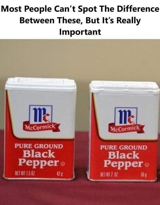
In busy retail settings, purchasing decisions are often made in seconds, guided as much by visual cues as by detailed comparison. Elements like package size, color, and placement can subtly influence how a product’s value is perceived. These design choices may seem minor on their own, but together they can affect how shoppers interpret quantity and quality at a glance.
A recent dispute between McCormick & Company and Watkins Incorporated highlights how these factors come into focus. The concern centers on packaging adjustments that altered the amount of product while maintaining a similar external appearance. According to the claims, this continuity could lead some shoppers to assume the contents remained unchanged.
Another aspect of the discussion involves visibility. Some brands use clear containers that allow customers to see the product inside, while others rely on opaque packaging that emphasizes exterior design. When placed side by side, these differences can shape perception, especially for routine purchases where people rely on quick visual impressions rather than closely reading labels.
For consumers, the takeaway is practical: small details matter. Checking net weight, comparing unit prices, and taking a moment to look beyond packaging can help ensure informed choices. At the same time, the broader conversation reflects how trust is built—not only through compliance with labeling standards, but also through clarity in presentation. In everyday shopping, awareness and transparency go hand in hand.