The Subtle Story Behind a Familiar Snack Logo
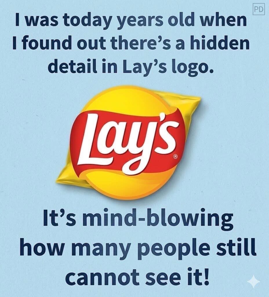
At first glance, the Lay’s logo appears clean and straightforward: a bright yellow circle crossed by a flowing red band. Yet a closer look reveals a thoughtful composition designed to feel instantly recognizable. The curved red shape is not just decorative—it guides the eye across the logo, creating movement and balance. This gentle visual flow…